I’ve been talking a lot about landing pages lately.
I did a 20 minute landing page makeover for NetSuite, highlighted 5 of our top converting landing pages, and have 10+ editions of “Critiquing Your Google AdWords Campaigns” blog series where I rate and score Google ads and their accompanying landing pages.
But before I get into why I think landing pages are so important, let’s first answer an important question…
What is a Landing Page?
If you Google Image search “landing page examples”, here’s what you’ll get.
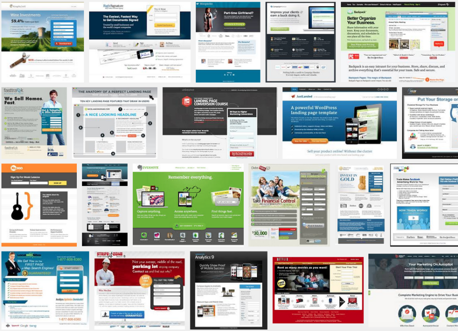
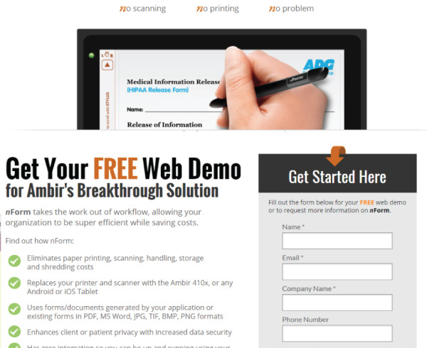
Lots and lots of web pages, some with buttons to click, forms to fill, numbers to call, or a combination of all three.
A landing page is a single web page that exists for the sole purpose of getting your user to take action.
Landing pages can sit on your website directly, or by using a third party platform such as Unbounce, Instapage, or Hubspot.
I always say that for businesses, a website really only has two main purposes:
- To Attract Visitors
- To Convert Visitors into followers, prospects, customers and/or sales.
A landing page helps with the latter (conversion).
So…
Why are Landing Pages so Important?
I recently attended a Conversion event in Toronto where the keynote speaker’s main message was “NSAMCWALP”, or “Never Start A Marketing Campaign Without A Landing Page”.
It’s probably pretty accurate, you shouldn’t start a marketing campaign without a landing page, here’s why…
1. Landing Pages Remove Distractions
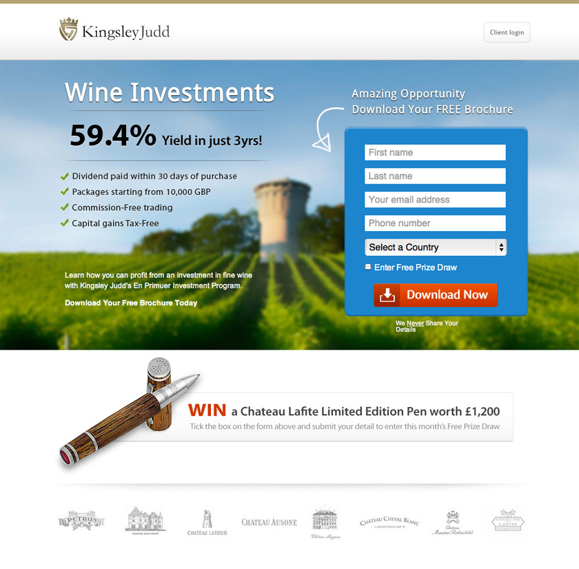
One of the key features of a landing page is that it keeps the user focused on the conversion, such as a purchase, download, form completion, free trial, or whatever it is you want them to do.
You do this by removing as many distractions as possible.
That means no links. No links to your blog, your about us page, your Facebook or Twitter account – not even to your website.
Don’t give users a reason to exit your landing page or a reason not to take action (now).
Keep them focused on the conversion, always.
2. Landing Pages Offer Customers Clarity & Purpose
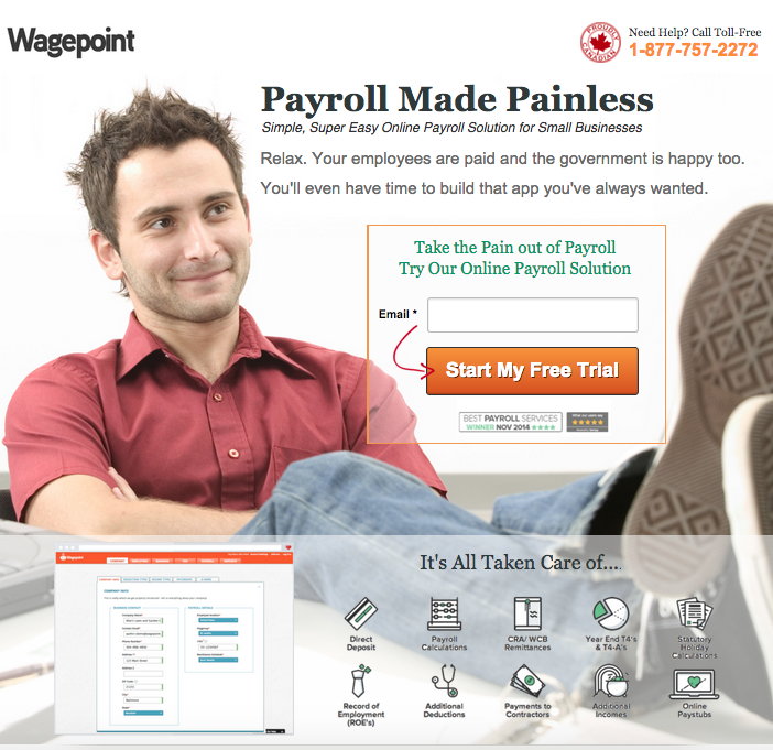
There’s a reason landing pages are only one page in length: if you want to get people to take action you can’t expect them to research, analyze, or even read!
In fact, you have around eight seconds or less to capture their attention.
The good news is that there are ways to get their attention and have them take action (or convert), here’s a few tips:
- Create one (and one only) action you want a user to take such as download a white paper, request a quote, start a free trial, or make a purchase.
- Use a headline and sub-headline that is clear and to the point (often this will be the only thing people read).
- Focus your copy not on what your product or service does, but what your product or service does for your customer (e.g. save time, reduce time or hassle, solve a problem, create and opportunity).
- Use imagery of what your prospects look like, what problems they have, and/or what life looks like once they’ve signed up for your business.
- Make an emotional connection with your landing pages, as research shows that people make are more prone to make decisions on an emotional or subconscious level.
3.Landing Pages Have a Call to Action (CTA)
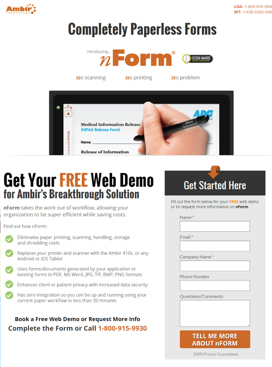
A Call to Action (CTA) is the one action you want people to take on your landing page.
All your copy, design, and images should support your CTA.
Even after taking a glance at a landing page, it should be crystal clear what the CTA is.
Use a big button in a contrasting colour, arrows to get a user’s attention, and if using a form, only collect information from the user that you’ll actually use.
Bonus: don’t use the word “submit” on your CTA button, make it more action-oriented such as “Get Started”, “Start Learning About (topic)”, or “Start My Free Trial”.
4. Landing Pages Force People to Make a Decision
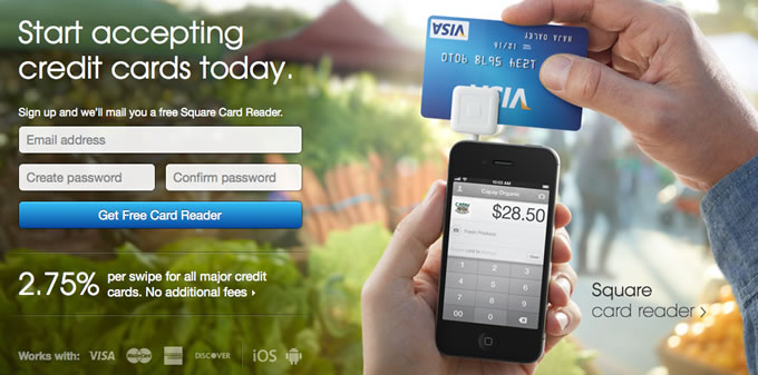
Getting someone to make a decision and take action is the sole purpose of any landing page.
You have to help them make a decision by reducing distractions (see #1), having a clear message (see #2), and extremely obvious CTA (see #3).
Here’s a few other tips that have been proven to increase conversion:
- Make them an irresistible offer (an offer that’s too good to turn down).
- Increase your trust and credibility by using testimonials, client logos, accreditations or awards.
- Use scarcity wherever possible (e.g. only 3 items left, book by x date).
- Highlight how much better life will be with your product, how much they’ll learn with your eBook or white paper, or how easy your app is to install and start using.
- Reduce a user’s anxiety by assuring them you’ll maintain their privacy and won’t spam them (don’t use the word “spam”), won’t call them on the phone (or specify why you would), or if there’s no credit card required upon signup.
5. Landing Pages Can Be Tested & Optimized
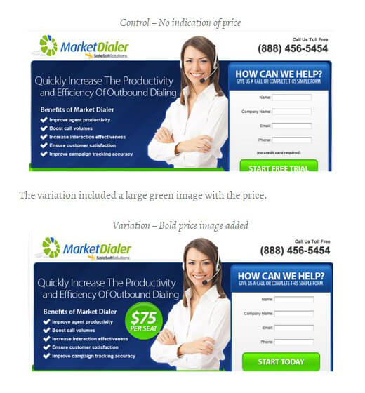
Like most things in marketing, landing pages are both an art and a science.
They often include copywriting, imagery, design, offers, CTAs, buttons, forms, trust symbols, and testimonials.
The good news is that all these things can be tested!
Test headlines, images, prices, colours, copy, form fields, location of CTA, colour and text of CTA button: the purpose is to see what your users respond to the most.
There’s lots of landing page and web page testing tools out there that will allow you to easily create both split a/b or multivariate tests.
The key is to always be testing, always be optimizing, and always be using landing pages 🙂
Need help with landing pages for PPC campaigns or website testing and optimization? Give us a shout.

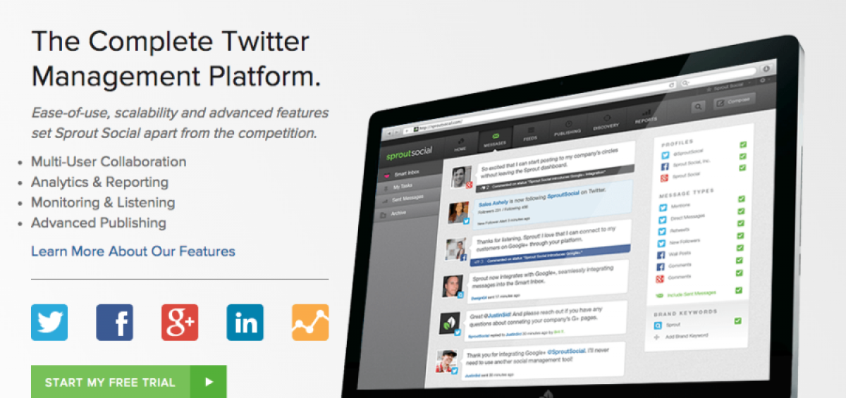


Landing pages are a key component of online marketing campaigns. Since landing pages are focused on conversions, improving their performance can lead to significant improvements in business results. Landing page optimization can help you lower your customer acquisitions costs, acquire more customers, and maximize the value of your ad spend. I am obliged for sharing those suggestions for landing page optimizations. It will encourage entrepreneurs to work more effectively on digital marketing and gain potential results from it.